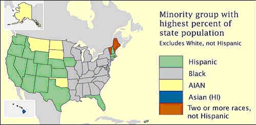
This map indicates the proportional data values with the assign shading.
Sunday, December 5, 2010
DOQQ MAP
Digital Orthophoto Quarter Quads are digital aerial images. It contains orthorectified aerial photography at a resolution of 1 meter. This map indicates flights that were done for a statewide colored infrared in January – March 1998
URL: http://www.lib.ncsu.edu/gis/doqq.html
URL: http://www.lib.ncsu.edu/gis/doqq.html
Histogram
A histogram is a display of statistical information that uses rectangles to show the frequency of data items in successive numerical intervals of equal size.This map indicates teh score on the final exam.
URL: http://media.techtarget.com/digitalguide/images/Misc/iw_histogram.gif
Univariate choropleth maps
Univariate choropleth map indicates only one specific set of data. In this case polulation. This map shows a percentage of individuals in different age groups that are experiencing proverty in the United States.
URL: http://www.cdc.gov/pcd/issues/2007/oct/images/07_0091_02.gif
Standardized choropleth maps
This map shows Canada’ s percentage of population aged 14 years and under. With the various colors are correlating to the density per unit area.
URL http://www.statcan.gc.ca/pub/92f0138m/2008003/figures/figure3.1-en.jpg:
Range graded proportional circle map
The range graded proportional circle is a symbol form, and varies by its size from place to place, in proportion to the quantities the symbol represents. This indicates Canada’s population distributions in 1980.
URL: http://www.d.umn.edu/geog/cartfolder/HTML%20Pages/Prop-Symbol1.htm
Bivariate choropleth map
A bivariate map shows two variables on a single map by combining two different sets of graphic symbols or colors. This map describes how to map two variables using functions in the default GUI.
URL: http://proceedings.esri.com/library/userconf/proc99/proceed/papers/pap171/p171.htm
Classed chropleth map
A classed choropleth maps determines the height and shading or color intensity of the bar for each map classed. The map above portrays data for the 50 states and Puerto Rico. The subject is the ratio of the number of males in the population compared to the number of females.
Thematic map
This is an early thematic map. This map has a contour beginning as this is an early sixteen century in the forms of lines as the equal depth on the river.
URL: http://indiemaps.com/blog/2009/11/the-first-thematic-maps/
Cadastral maps
Cadastral map is described as the metes-and-bounds real property of a country. They are commonly includes details of the ownership, the tenure, the precise location, the dimensions, the cultivations if rural, and the value of individual parcels of land. This map indicaes the lines ownership of Delaware and sorrounding areas.
URL: http://www.dalisproject.org/images/cadastral_map.jpg
URL: http://www.dalisproject.org/images/cadastral_map.jpg
PLSS Maps
The Public Land Survey System (PLSS) is a way of subdividing and describing land in the United States. All lands in the public domain are subject to subdivision by this rectangular system of surveys, which is regulated by the U.S. Department of the Interior, Bureau of Land Management. This map indicates a portion of Minnesota's PLSS Map, Minnesota is marked off into sections and townships.
URL: http://www.fairview-industries.com/standardmodule/mn-exmp2.gif
URL: http://www.fairview-industries.com/standardmodule/mn-exmp2.gif
Hypsometric maps
URL: https://blogger.googleusercontent.com/img/b/R29vZ2xl/AVvXsEiwT3VdjmyT9LQcHSYpbSLNVXIFibAD1kTq7-nmvHCorqw5R8mcvyENkgZl-wg7OvZ9PQdAJpSNnl6e9rjla69_K_3nZ6S15foZCzwgaEf1EtLl2lQE6GEzY9yUy_Iy_icSQhP0Yjyu3EqB/s400/Hypsometric.jpg
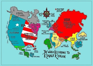
Propaganda maps

Dot distribution maps
Dot Distribution Maps can be useful to help in showing the population of a particular location. This map indicates the population of military families and where they live.
URL: http://operationmilitarykids.ohio4h.org/resources/images/dotMap.gif
URL: http://operationmilitarykids.ohio4h.org/resources/images/dotMap.gif
Choropleths map
The choropleth map provides an easy way to visualize how a measurement varies across a geographic area or it shows the level of variability within a region.This maps indicates the election results for the 2004 presidential election.
URL: http://en.wikipedia.org/wiki/File:2004US_election_map.svg
Proporational circle maps
A proportional circle map is a comparative circle map which utilizes circles to create point data. The map relates to specific data. This map describes the major industries. The circles and segments indicates relative importance.
URL: http://www.lib.utexas.edu/maps/europe/west_germany_ind_1972.jpg
Isoline Maps
An isoline map is a map with continuous lines joining points of the same value.
They are usually used to portray the weather. This map indicates the highs and lows of temperatures of a particular area.
URL: http://personal.uncc.edu/lagaro/2101/2101_ProjectsF99/isolines.gif
Cartographic animations
A cartographic animation is the application of animation, it is either a computer or video, add to a temporal component to a map displaying change in some dimension. The map indicates the animation produced after the 2004 Tsunami showing how the waves spread across the Indian Ocean.
URL: http://upload.wikimedia.org/wikipedia/commons/1/12/2004_Indonesia_Tsunami_100px.gif
Infrared aerial photo
This photo is a color-infrared kite aerial photograph of the upland study forest, Fort Leavenworth, Kansas, May 2000. It indicates the active vegetation as it appears in the red and pink colors.
URL: http://www.kgs.ku.edu/Current/2002/aber/jpegs/fig16.jpg
Black and White aerial photo
Black white aerial photographs are images of the Earth taken from the air and from space show a great deal about the planet's landforms, vegetation, and resources. This photo is an aerial view of Chigmit Mountains in Lake Clark National Park, Alaska, USA.
URL: http://www.terragalleria.com/black-white/parks/np-image.lacl1646-bw.html
Doppler radar
A doppler radar is a specialized radar that makes the use of the doppler effect to produce velocity data about objects at a distance. This map of the United States and it indicates the weather across the country as of December 6, 2010 at 8:05pm EST.
URL: http://www.weather.com/maps/maptype/dopplerradarusnational/index_large.html
LIDAR MAP
The acronym for LIDAR is Light Detection And Ranging. It is an optical remote sensing technology that measures properties of scattered light to find range and/or other information of a distant target. This map describes the Lower Newton Creek map. It demonstrates how new map data better defines the stream channel.
URL: http://www.co.benton.or.us/cd/riparian/images/lidar_map1.jpg
Isobars
Isobars are lines of equal atmospheric pressure drawn on a meteorological map. Each line passes through a pressure of a given value, provided certain rules are followed.
URL: http://www.newmediastudio.org/DataDiscovery/Hurr_ED_Center/Hurr_Structure_Energetics/Closed_Isobars/Closed_Isobars_fig02.jpg
Isotachs Map
The isotachs has a line that is connecting the location of the same wind speed. This map indicates the wind direction of the United States.
The isotachs has a line that is connecting the location of the same wind speed. This map indicates the wind direction of the United States.
URL: http://www.rap.ucar.edu/weather/model/eta00hr_300_wnd.gif
ISOHYETS
An isohyets map consists of lines that are joining the points of equal precipitation. This is an isohyet map of Texas. This isohyet map shows the mean annual precipitation of Texas from 1951-1980
URL: https://blogger.googleusercontent.com/img/b/R29vZ2xl/AVvXsEgvQ9-_MNhCLFc9boGzEwpbYloHmmibsMUq90GMfXijJ5RYYJoXWvfvUmhpCQAFKF8LX0KoC32VcJZt8JTqkqPSHrZLSgW8bliXlLouN7tgQXRscg-zepXJYqeDs15My9_B3pTy9MHWysw/s1600/20.gif
ISOPLETHS
An isopleth maps generalizes and simplifies data with a continuous distribution. This map shows the data as a third dimension. This map indicates the measurements of acid rainfall in the United States by evaluating the pH level of rain in different areas.
URL: http://dwb4.unl.edu/Chem/CHEM869V/CHEM869VLinks/nadp.sws.uiuc.edu/isopleths/maps1998/phfield.gif
ISOPACH MAP
An isopach map is a map illustrates the variation of thickness within a tabular unit or stratum. Isopachs are described as contour lines of equal thickness over an area. This map indicates the reservoir with contours shown with red dashes.
URL: http://www.glossary.oilfield.slb.com/files/OGL98135.gif
Nominal area choropleth map
Choropleth Maps are based on predefined aerial units. In the map, it describes each group of data as a ratio value, and use what a graded color series to show least intensity to most intense.
URL: https://courseware.e-education.psu.edu/courses/geog482/graphics/citationexample.jpg
Bilateral graph
A bilateral graph is indicates two different variables being measured at the same time. This map provides the measure of who the gender of different people firstly and what their political views are.
URL: http://neuropolitics.org/parents1.gif
Accumulative Line Graph
Accumulated line graphs are line graphs that are "stacked" on top of each other. The graph indicates three different lines graphs and different shades to indicate them.
URL: http://www.aip.de/~weber/doc/jpgraph/docs/html/img/example17.png
WINDROSE
A windrose is a graphic tool used to determine the succinct view of how the wind speed and direction is distributed. This plot is a description of the LaGuardia Airport in New York, New York wind speed and direction.
URL: http://upload.wikimedia.org/wikipedia/commons/7/70/Wind_rose_plot.jpg
INDEX VALUE PLOT
An index value plot is a way to represent the relativity of different values to an index value. It is a graphical visualization that measures the stock market breakdown.
URL: http://water.usgs.gov/waterwatch/regplots/real/real_us_2.gif
SCATTER PLOT
Scatter plot shows the relationship between two variables by displaying data points on a two dimensional graph. This graph is an indication of SAT versus Beta Test.
URL: https://blogger.googleusercontent.com/img/b/R29vZ2xl/AVvXsEjUVFqU2nWJzRAcJ80uCzxr994UlBqPFOnsHt_HqSegQ7Yis9j7BtuAIcUnMPNNkAb6EnkCaTWwWHf8BO3iA2f1JTN7RBddRcOpRgrRiaHo0XAV7KZjxflkgZwcq1rAnnHB8g9vVd1TE1q9/s400/SCATTER+PLOT.gif
DLG
This map indicates the progress of hig resolution in the State of Florida. The map shows the Florida sub basin that appear in Florida and the different colors indicate the progress.
DRG
This indicates roads lakes and the contour of the ground is displayed all in one flat map. URL: http://gpsinformation.us/Maps/cartersvilledrg.gif
DEM
This displays san fransico mountain ranges and crates.
URL: http://www.adrian.edu/earthscience/Internships/Holesinger/USGS_DEM.jpg.jpg
Climograph
This displays months which tempetures are hotter tends to recieve less rainfall.
URL: http://drought.unl.edu/whatis/climographs/clim-atl.gif
Population Profile
This map indicates the population density of residence 25 years or older.URL: http://pics3.city-data.com/ccdmapsf/ccdmf390.png
Triangular plot
The triangular plot is a graph of 3 variables. It is most often used in geologic studies. In the graph, it indicates various slips of allocations of Hmax Kauai.
URL: http://www.pmel.noaa.gov/maillists/tmap/ferret_users/fu_2007/jpgCqrZqdDwYG.jpg
Parallel coordinate graph
This map indicates a 3D parallel coordinate view of all cells and nine the selected genes. The in the parallel coordinates, each gene is represented by one parallel axis. The expression levels of a cell are defined as a point on each axis.
URL: http://vis.lbl.gov/Events/SC07/Drosophila/3DParallelCoordinates.png
Saturday, December 4, 2010
Box plot
Box plots are used to convey location and variation information in data sets. It is usually used to detect and illustrate a location and variation changes between different groups of data. This box plot, compares four machines for energy output, it indicates that machines can have a significant effect on energy for both location and variation.
URL: http://www.itl.nist.gov/div898/handbook/eda/gif/boxplot0.gif
Stem and leaf plot
Stem-and-leaf plots are a method for showing the frequency with which certain classes of values occur. Stem and leaf plot indicates the number of students enrolled in a dance class in the past 12 years.
Similarity matrix
Similarity matrix express the similarity between two points. This map indicates the sililmarity between the phot indexes.
URL: http://www.fxpal.com/systems/MediaAnalysis/sim10000.gif
Correlation matrix
A correlation matrix map describes the correlation relationship between two variables. The correlation matrix map is one of common used in statistics.
URL: http://www.kltprc.net/policynotes/Gifs/Tab_005A_4.gif
URL: http://www.kltprc.net/policynotes/Gifs/Tab_005A_4.gif
Star plots
A star plot map consists of a graphical data analysis. It examines the behavior of all variables in a multivariate data set. Each point represents a different variable in the multivariate data set.
URL: https://blogger.googleusercontent.com/img/b/R29vZ2xl/AVvXsEh58qS-4O-lnfvJR1WJA5CNn-SthfOKeO28PswGEOfFwKCnHmPx9JAwB6wKHU7NeSOzraE9SGDeEIQgmFvvy9OFoXRsDBQaCBtDRhVMzCMR5_4fdTOx3ic_P20nvkBgwIp8ksaARYrYngjc/s400/Star+Plot.gif
URL: https://blogger.googleusercontent.com/img/b/R29vZ2xl/AVvXsEh58qS-4O-lnfvJR1WJA5CNn-SthfOKeO28PswGEOfFwKCnHmPx9JAwB6wKHU7NeSOzraE9SGDeEIQgmFvvy9OFoXRsDBQaCBtDRhVMzCMR5_4fdTOx3ic_P20nvkBgwIp8ksaARYrYngjc/s400/Star+Plot.gif
Topographic
This map indicates the details on a topographic map, outlining the contour lines drawn to represent changes in the elevation. On a topographic map the path that crosses the contour lines, will be either be climbing or descending. A path that is running parallel to contour lines is relatively flat.
URL: http://www.compassdude.com/i/topo-example.gif
URL: http://www.compassdude.com/i/topo-example.gif
Planimetric
A planimetric map is designed to portray only the horizontal positions of features on a map. This map is of Vancouver, Washington.
URL: http://www.nps.gov/history/history/online_books/fova/clr/images/map2-21.jpg
Mental
A mental map refers to a person's point of view. The map indicates a person’s view on his or her living surroundings in Coal City, Illinois in 1940.
URL: http://www.uky.edu/~ulack/Geo152/unnumbered%20figure%20pg%2003.jpg
URL: http://www.uky.edu/~ulack/Geo152/unnumbered%20figure%20pg%2003.jpg
Subscribe to:
Comments (Atom)


