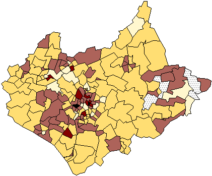
This map indicates the proportional data values with the assign shading.
Sunday, December 5, 2010
DOQQ MAP
Digital Orthophoto Quarter Quads are digital aerial images. It contains orthorectified aerial photography at a resolution of 1 meter. This map indicates flights that were done for a statewide colored infrared in January – March 1998
URL: http://www.lib.ncsu.edu/gis/doqq.html
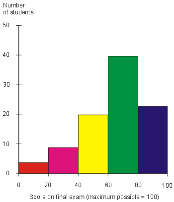
Histogram
A histogram is a display of statistical information that uses rectangles to show the frequency of data items in successive numerical intervals of equal size.This map indicates teh score on the final exam.
URL: http://media.techtarget.com/digitalguide/images/Misc/iw_histogram.gif
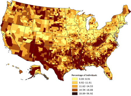
Univariate choropleth maps
Univariate choropleth map indicates only one specific set of data. In this case polulation. This map shows a percentage of individuals in different age groups that are experiencing proverty in the United States.
URL: http://www.cdc.gov/pcd/issues/2007/oct/images/07_0091_02.gif
Standardized choropleth maps
This map shows Canada’ s percentage of population aged 14 years and under. With the various colors are correlating to the density per unit area.
URL http://www.statcan.gc.ca/pub/92f0138m/2008003/figures/figure3.1-en.jpg:
Range graded proportional circle map
The range graded proportional circle is a symbol form, and varies by its size from place to place, in proportion to the quantities the symbol represents. This indicates Canada’s population distributions in 1980.
URL: http://www.d.umn.edu/geog/cartfolder/HTML%20Pages/Prop-Symbol1.htm
Bivariate choropleth map
A bivariate map shows two variables on a single map by combining two different sets of graphic symbols or colors. This map describes how to map two variables using functions in the default GUI.
URL: http://proceedings.esri.com/library/userconf/proc99/proceed/papers/pap171/p171.htm
Classed chropleth map
A classed choropleth maps determines the height and shading or color intensity of the bar for each map classed. The map above portrays data for the 50 states and Puerto Rico. The subject is the ratio of the number of males in the population compared to the number of females.
Thematic map
This is an early thematic map. This map has a contour beginning as this is an early sixteen century in the forms of lines as the equal depth on the river.
URL: http://indiemaps.com/blog/2009/11/the-first-thematic-maps/
Cadastral maps
Cadastral map is described as the metes-and-bounds real property of a country. They are commonly includes details of the ownership, the tenure, the precise location, the dimensions, the cultivations if rural, and the value of individual parcels of land. This map indicaes the lines ownership of Delaware and sorrounding areas.
URL: http://www.dalisproject.org/images/cadastral_map.jpg
PLSS Maps
The Public Land Survey System (PLSS) is a way of subdividing and describing land in the United States. All lands in the public domain are subject to subdivision by this rectangular system of surveys, which is regulated by the U.S. Department of the Interior, Bureau of Land Management. This map indicates a portion of Minnesota's PLSS Map, Minnesota is marked off into sections and townships.
URL: http://www.fairview-industries.com/standardmodule/mn-exmp2.gif
Hypsometric maps
URL: https://blogger.googleusercontent.com/img/b/R29vZ2xl/AVvXsEiwT3VdjmyT9LQcHSYpbSLNVXIFibAD1kTq7-nmvHCorqw5R8mcvyENkgZl-wg7OvZ9PQdAJpSNnl6e9rjla69_K_3nZ6S15foZCzwgaEf1EtLl2lQE6GEzY9yUy_Iy_icSQhP0Yjyu3EqB/s400/Hypsometric.jpg
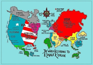
Propaganda maps

Dot distribution maps
Dot Distribution Maps can be useful to help in showing the population of a particular location. This map indicates the population of military families and where they live.
URL: http://operationmilitarykids.ohio4h.org/resources/images/dotMap.gif
Choropleths map
The choropleth map provides an easy way to visualize how a measurement varies across a geographic area or it shows the level of variability within a region.This maps indicates the election results for the 2004 presidential election.
URL: http://en.wikipedia.org/wiki/File:2004US_election_map.svg
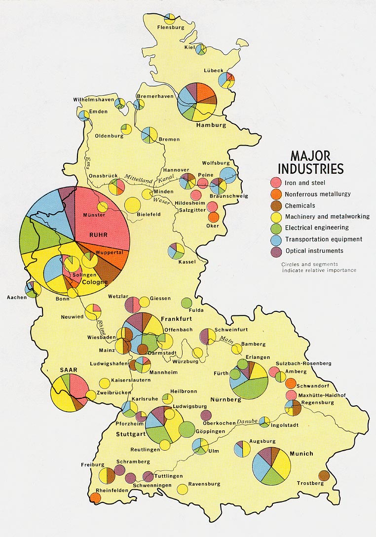
Proporational circle maps
A proportional circle map is a comparative circle map which utilizes circles to create point data. The map relates to specific data. This map describes the major industries. The circles and segments indicates relative importance.
URL: http://www.lib.utexas.edu/maps/europe/west_germany_ind_1972.jpg
Isoline Maps
An isoline map is a map with continuous lines joining points of the same value.
They are usually used to portray the weather. This map indicates the highs and lows of temperatures of a particular area.
URL: http://personal.uncc.edu/lagaro/2101/2101_ProjectsF99/isolines.gif
Cartographic animations
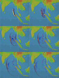
A cartographic animation is the application of animation, it is either a computer or video, add to a temporal component to a map displaying change in some dimension. The map indicates the animation produced after the 2004 Tsunami showing how the waves spread across the Indian Ocean.
URL: http://upload.wikimedia.org/wikipedia/commons/1/12/2004_Indonesia_Tsunami_100px.gif
Infrared aerial photo
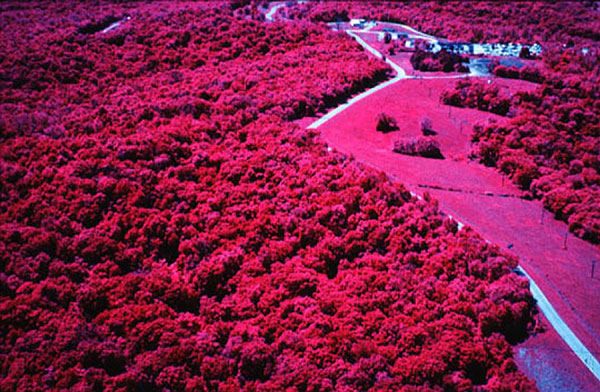
This photo is a color-infrared kite aerial photograph of the upland study forest, Fort Leavenworth, Kansas, May 2000. It indicates the active vegetation as it appears in the red and pink colors.
URL: http://www.kgs.ku.edu/Current/2002/aber/jpegs/fig16.jpg
Black and White aerial photo
Black white aerial photographs are images of the Earth taken from the air and from space show a great deal about the planet's landforms, vegetation, and resources. This photo is an aerial view of Chigmit Mountains in Lake Clark National Park, Alaska, USA.
URL: http://www.terragalleria.com/black-white/parks/np-image.lacl1646-bw.html
Subscribe to:
Posts (Atom)