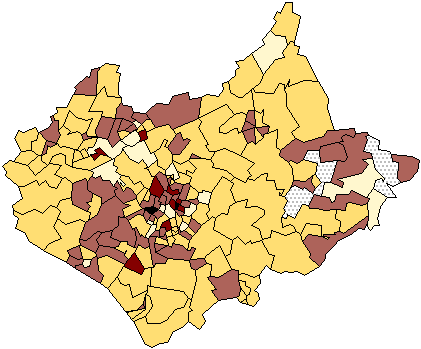
This map indicates the proportional data values with the assign shading.
george
Sunday, December 5, 2010
DOQQ MAP
Digital Orthophoto Quarter Quads are digital aerial images. It contains orthorectified aerial photography at a resolution of 1 meter. This map indicates flights that were done for a statewide colored infrared in January – March 1998
URL: http://www.lib.ncsu.edu/gis/doqq.html
URL: http://www.lib.ncsu.edu/gis/doqq.html
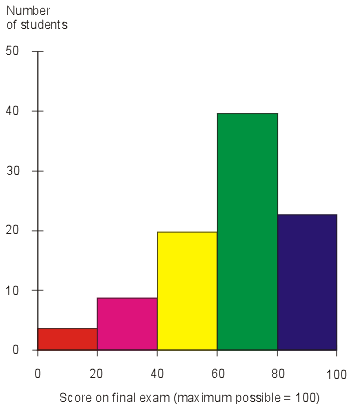
Histogram
A histogram is a display of statistical information that uses rectangles to show the frequency of data items in successive numerical intervals of equal size.This map indicates teh score on the final exam.
URL: http://media.techtarget.com/digitalguide/images/Misc/iw_histogram.gif
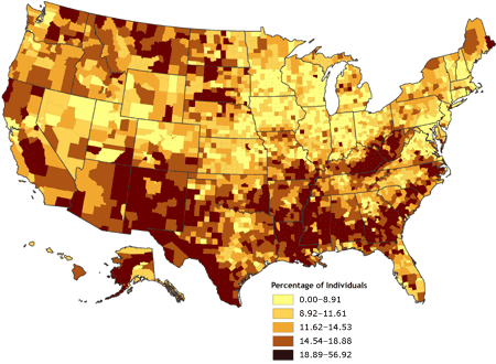
Univariate choropleth maps
Univariate choropleth map indicates only one specific set of data. In this case polulation. This map shows a percentage of individuals in different age groups that are experiencing proverty in the United States.
URL: http://www.cdc.gov/pcd/issues/2007/oct/images/07_0091_02.gif
Standardized choropleth maps
This map shows Canada’ s percentage of population aged 14 years and under. With the various colors are correlating to the density per unit area.
URL http://www.statcan.gc.ca/pub/92f0138m/2008003/figures/figure3.1-en.jpg:
Range graded proportional circle map
The range graded proportional circle is a symbol form, and varies by its size from place to place, in proportion to the quantities the symbol represents. This indicates Canada’s population distributions in 1980.
URL: http://www.d.umn.edu/geog/cartfolder/HTML%20Pages/Prop-Symbol1.htm
Bivariate choropleth map
A bivariate map shows two variables on a single map by combining two different sets of graphic symbols or colors. This map describes how to map two variables using functions in the default GUI.
URL: http://proceedings.esri.com/library/userconf/proc99/proceed/papers/pap171/p171.htm
Subscribe to:
Posts (Atom)


